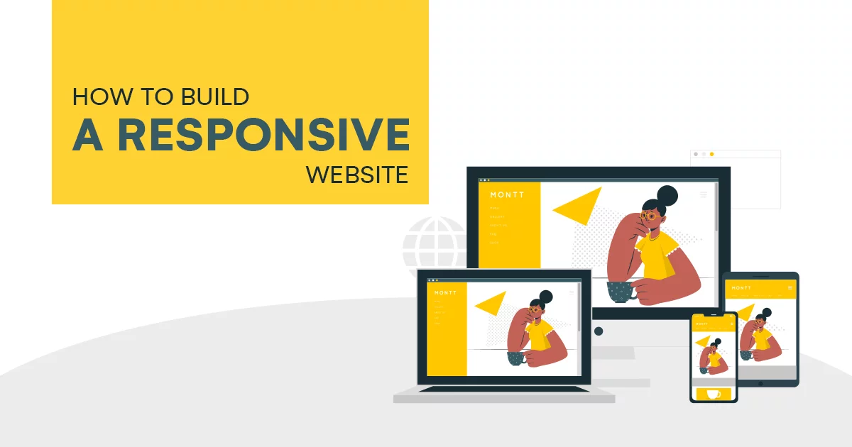
Creating a Responsive Web Design: A Step-by-Step Guide with Code
In the dynamic landscape of web development, creating a responsive web design is crucial to ensure your website looks and functions seamlessly across various devices and screen sizes. In this step-by-step guide, we’ll walk through the key principles and provide code snippets to help you craft a responsive design that enhances the user experience.
Step 1: Understand the Viewport
The viewport is the user’s visible area of a web page. Ensure your HTML includes the following meta tag in the `<head>` section to set the viewport width to the device width:
html

<meta name="viewport" content="width=device-width, initial-scale=1.0">
This meta tag ensures that the webpage scales appropriately based on the user’s device.
Step 2: Use Fluid Grids
Implementing a fluid grid layout is fundamental to responsive design. Instead of fixed pixel values, use percentages for widths. For example:
css

.container {

  width: 100%;

  max-width: 1200px; / Set a maximum width if needed /

  margin: 0 auto; / Center the container /

}
Step 3: Apply Flexible Images
Prevent images from overflowing their containers by applying `max-width: 100%;` to the image CSS. This ensures images scale down proportionally within their parent elements.
css

img {

  max-width: 100%;

  height: auto; / Ensure the image maintains its aspect ratio /

}
Step 4: Media Queries for Breakpoints
Use media queries to apply styles based on the device’s characteristics. Define breakpoints where the layout or styling needs adjustment. For example:
css

/ Small devices (phones) /

@media only screen and (max-width: 600px) {

  body {

    font-size: 14px;

  }

}
Step 5: Flexbox and Grid Layouts
Leverage CSS Flexbox and Grid Layout for complex and flexible designs. They provide powerful tools for creating responsive and dynamic layouts.
css

.container {

  display: flex;

  justify-content: space-between;

  align-items: center;

}

/ Or use Grid Layout /

.container {

  display: grid;

  grid-template-columns: 1fr 2fr 1fr;

}
Step 6: Testing Across Devices
Regularly test your website on various devices and browsers to ensure a consistent and optimal user experience. Browser developer tools often include responsive design modes for testing.
Step 7: Optimize Performance
Consider optimizing performance for mobile devices by lazy loading images, minimizing HTTP requests, and using compressed assets.
Now Let’s build a simple responsive website from start to finish. For simplicity, we’ll create a one-page website using HTML and CSS, incorporating the key responsive design principles mentioned earlier.
Step 1: Set Up HTML Structure
Create an HTML file (`index.html`) with a basic structure:
html
<!DOCTYPE html>
<html lang="en">
<head>
<meta charset="UTF-8">
<meta name="viewport" content="width=device-width, initial-scale=1.0">
<link rel="stylesheet" href="styles.css">
<title>Responsive Website</title>
</head>
<body>
<header>
<h1>My Responsive Website</h1>
</header>
<section class="main-content">
<p>Welcome to my website! It's fully responsive.</p>
</section>
<footer>
<p>© 2024 My Responsive Website</p>
</footer>
</body>
</html>Step 2: Add Basic Styling
Create a CSS file (`styles.css`) for basic styling:
css

body {

    font-family: 'Arial', sans-serif;

    margin: 0;

    padding: 0;

}

header, footer {

    background-color: 333;

    color: fff;

    text-align: center;

    padding: 1em 0;

}

.main-content {

    max-width: 800px;

    margin: 0 auto;

    padding: 20px;

}

@media only screen and (max-width: 600px) {

    header, footer {

        font-size: 14px;

    }

    .main-content {

        padding: 10px;

    }

}
Step 3: Test and Refine
Open your `index.html` file in a web browser and observe how the website looks. Resize your browser window to see the responsive adjustments. The media query in the CSS will apply styles for screens with a width of 600 pixels or less.
Step 4: Enhance Responsiveness with Flexbox
Let’s enhance our layout using Flexbox for better alignment. Update the CSS file:
css

body {

    display: flex;

    flex-direction: column;

    min-height: 100vh;

}

header, footer {

    flex-shrink: 0;

}

.main-content {

    flex-grow: 1;

    display: flex;

    justify-content: center;

    align-items: center;

    flex-direction: column;

}
Step 5: Optimize for Mobile Devices
Consider optimizing for mobile devices by adjusting font sizes and line heights. Update the media query in `styles.css`:
css

@media only screen and (max-width: 600px) {

    header, footer {

        font-size: 14px;

    }

    .main-content {

        padding: 10px;

        text-align: center;

    }

}
This simple example demonstrates the building blocks of a responsive website. As you develop more complex projects, you can incorporate additional features, such as responsive navigation menus, images, and advanced layout structures. Continuous testing and refinement are essential for achieving optimal responsiveness across various devices.
Conclusion
Creating a responsive web design involves embracing a fluid and flexible approach to accommodate diverse user devices. By incorporating these steps and continually testing, you’ll be on your way to delivering a seamless and visually appealing experience across the ever-expanding array of devices in the digital landscape.
